
Mobile accounts for 59.45% of web traffic worldwide. We know that Google dominates the search engine pack with 91.62% of worldwide searches. In that same vein, your pages that you optimize for Google should be optimized for mobile, too.
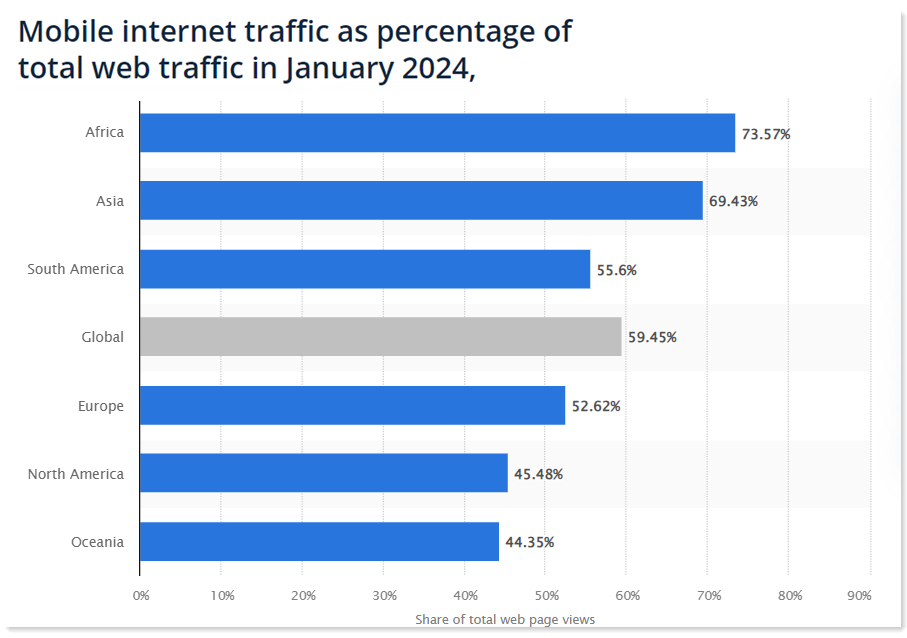
Image Source: Statista
A website that’s not optimized for mobile loses leads and conversions. Your website also becomes virtually invisible, and this hurts your rankings.
Mobile has become important, and Google continues to tweak its algorithms to reflect this change. But there is good news. Optimizing your site is easy, and the mobile SEO tips in this post will guide you through how to boost your website’s visibility.
We’ll also take a closer look at what mobile SEO is, why it’s important, and how to optimize your website for mobile.
What is Mobile SEO?
Mobile SEO means optimizing your site for mobile devices. It’s a search engine optimization technique that helps improve the visibility of websites in mobile-device search results. It also improves user experience.
A mobile-friendly site:
- Is understandable by search engines
- Loads fast
- Loads properly on mobile devices
- Allows mobile users to navigate the site with ease
- Has readable content that does not require readers to zoom
- Offers users value
What's the Importance of Mobile SEO?
Mobile SEO is important for three main reasons. People prefer to search on mobile, Google prioritizes websites that provide a seamless experience on mobile, and smartphones dominate voice search.
Let’s take a closer look at each of these so we can better understand why mobile SEO is so important.
People Prefer to Search on Mobile
Think of how mobile makes search so frictionless: it's handy for quick "who's that actor" reminders while you're watching a show. It helps you find dinner while you're out, stain removal tips while you're in a pinch, and recipe ideas when you're wandering the aisles at the grocery store. It makes sense that 58% of Google searches come from mobile devices. More people prefer to search on mobile, and that trend is likely to continue.
It is important to make your brand discoverable on mobile and provide relevant content that can help you attract and nurture potential customers.
Let's take it even further than search alone. Consider ecommerce.
Think with Google found that over 40% of consumers prefer to complete their shopping journey (from research to purchase) on mobile. They also want faster mobile experiences. Just a one second delay in load time can impact conversions by 20%.
Consumers also want a seamless experience across all touchpoints. They want to move between your mobile site, desktop site, app, and even your brick-and-mortar store conveniently.
Clearly, your target audience is using their mobile devices to find content. Having a mobile-friendly website increases the chances of them finding your brand.
Google Prioritizes Websites that Provide a Seamless Experience On Mobile
As we mentioned at the start, most searchers prefer to use Google--for both mobile and desktop searches. Given its dominance, it’s important to consider its mobile-first index rollout.
The mobile-first index was no surprise; it grew over time. Google has been talking about mobile-friendly websites for more than a decade.
In 2013, Google announced changes in smartphone search results. Website owners were to avoid mistakes like faulty redirects and smartphone-only errors. Sites that provided bad mobile experiences dropped in smartphone search result rankings.
In 2014, they added a mobile-friendly label to websites that offered a great user experience on mobile.
In 2015, Google notified users whose sites were not mobile-friendly. They launched mobile usability reports and provided users with a mobile-friendly testing tool. The same year, mobile-friendliness became a ranking signal.
In 2016, mobile search results got a boost that increased the ranking effect. The boost was to help users find pages that were mobile-friendly and relevant. In the same year, Google started mobile-first indexing experiments. These mean that their algorithms primarily use a website’s mobile version to rank pages.
In January 2017, Google announced that content not accessible on mobile might not rank as high. Some techniques that led to ranking penalties included:
- Pop-ups that covered the main content when a user is browsing a page or when they navigate to it
- A standalone interstitial that the user has to dismiss before they can get to the main content
- Layouts with an above-the-fold portion that looks like a standalone interstitial that has original content inline underneath the fold
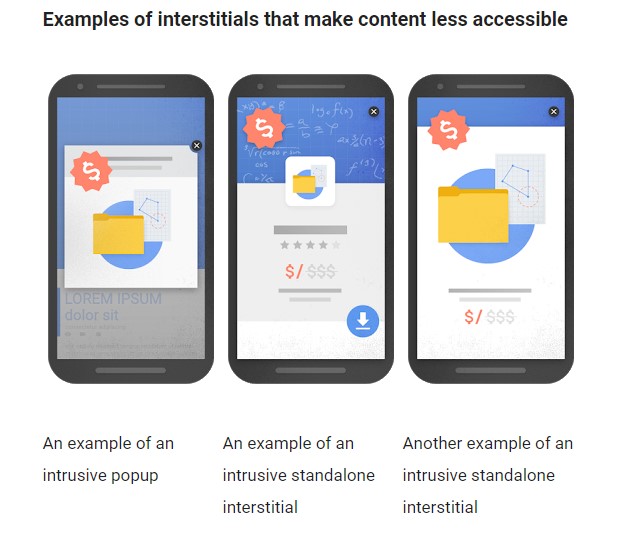
Image Source: Google
In 2018, the speed update led to speed becoming a ranking factor for mobile search results.
In 2019, Google rolled out the mobile-first index. The determining factors are:
- Quality mobile-friendly content (including images, videos, text, and links)
- Metadata (titles, robots metatags, descriptions) should be present on both mobile and desktop versions
- Structured data should be present on both the desktop and mobile version of the site
They also recommended having a single URL for both mobile and desktop sites. If you have separate URLs, ensure that you can access data and messages from both sites.
Smartphones Dominate Voice Search
Clutch found that most internet users use smartphones to access voice assistants.
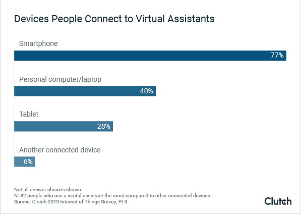
Image Source: Clutch
Voicebot.ai also found that voice searches on smartphones occur while consumers drive (62%) and while they are relaxing at home (38%). Voice search also allows users to interact with their phones while doing other activities.
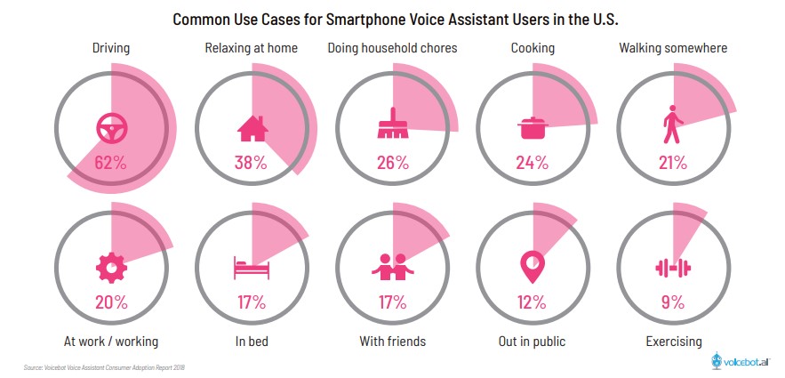
Image Source: Voicebot.ai
This report also found that more consumers used voice to search for products and services than for entertainment.
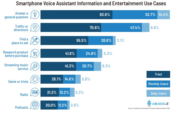
Image Source: Voicebot.ai
People who use voice search are also open to brands sending them relevant and helpful information.

Image Source: Think with Google
How to Make your Site Mobile Friendly
You can make small and big moves to make your site more mobile friendly. A couple of these tips take more technical work, but much of it is rooted in serving your page to people in a smaller format. Make your content digestible and easy to navigate on mobile. (No one wants to squint.)
Sentences should be concise, and paragraphs short. Make paragraphs and sentences easier to read for users who skim content.
Break up content into chunks so that white space separates paragraphs making it easier to skim and read. You can do this using subheading, H1 tags, images, or bullet points.
Visual content: videos that scale are excellent. Make sure that your images work well at a smaller scale, especially if they contain text. Just because the image scales down doesn't mean that people can still read your infographic.
Ahead are some more specific, technical strategies to make your site more mobile friendly.
1. Measure Your Site's Mobile Friendliness
To find the best areas to improve your site, you need to measure how mobile friendly it is. Google offers tools you can use to find your mobile opportunities.
Their tool Lighthouse runs your URL through a series of audits. It reports back on the page's performance across Core Web Vitals.
This is also built into Google's Search Console where you can single out mobile performance in your site's Core Web Vitals.
You can also use the Google Console to check for crawl errors. Search engines index your site by crawling. If they can’t crawl, then your content doesn’t appear on the search engine result pages (SERPs).
Your mobile users should see the same content your desktop users do. Which means that you need to ensure that all content formats are crawlable and indexable. These formats include videos, images, and text.
Google adds relevant badges to images to help searchers uncover images. Badges categorize images and text to help clarify actions you can take. You can use alt attributes for your images to make searches relevant for mobile users. It’s also important to optimize your content for voice search.
2. Improve Your Site Speed
There are two reasons your site' speed is so important.
Improving your site's speed can pay off in two ways--user experience and as a positive ranking factor. Both of those directly and indirectly benefit your site's SEO.
Mobile users, in particular, are often on the go and may not have the best internet connection. By serving a version of your site that's optimized for mobile, you're trimming down on unnecessary elements that can slow down load times, ensuring visitors aren't left waiting.
Speed became a mobile search ranking factor after the 2018 Google speed update. The update affected pages that loaded slowly. Google, however, insisted that search intent may supersede speed. Which means that a page may still rank for relevant content, even if it’s slow.
Even though your page will rank for relevant and useful content, optimizing the speed of your pages is a smart move. Check your site speed regularly to help uncover any underlying issues like large images or resource-hogging elements on your page.
Page Speed Insights checks if your web pages load fast on all devices.

Poor speed leads to increased bounce rates for websites. As load time moves from one to ten seconds, the bounce rate increases by 123%.
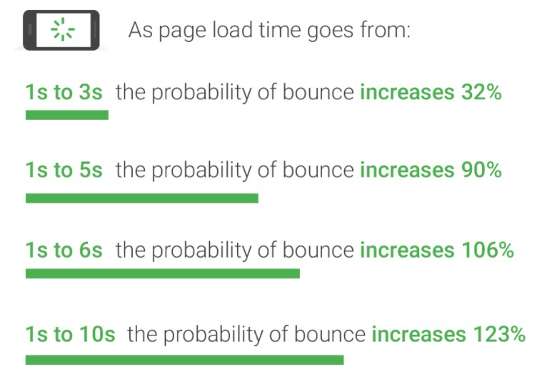
Image Source: Think with Google
The best practices to increase page speed include:
- Compress and optimize images. When not optimized, images take up lots of bandwidth. They are large, which means they take longer to load. You can also consider using JPEG format instead of PNG.
- Minimize HTTP requests. These requests are for the different elements of a page as it loads. They include images, stylesheets, scripts, and images. The more on-page components your page has, the longer the page will take to render.
- Minify CSS, HTML, and JavaScript files. These important files add to the number of requests your site makes when a user visits. You can increase page speed by removing unnecessary white space, unnecessary formatting, and code.
- Use asynchronous loading for JavaScript and CSS files. This allows some files to load simultaneously, thus speeding up your pages.
- Upgrade your web hosting once your site has more content and more visitors. Upgrading can increase your site speed.
- Enable browser caching. Store static files like media files, HTML documents, CSS, images, and JavaScript files so that they become easy to access. The database will not have to retrieve them one by one every time you get a new request.
- Enable Gzip compression. This compresses website files into a zip file. It reduces their size, leading to speed boosts to your site. When a consumer visits your site, the file unzips, allowing the user to access the content.
- Remove unnecessary plugins. The more plugins you have on your site, the more resources they need to load. Remove those you no longer use by deactivating or deleting them. Too many plugins will not only slow down your website but may also lead to security issues and crashes.
3. Embrace Mobile Response Design
A responsive design allows your site to dynamically change depending on access. For example, your website will look different depending on the device be it a tablet, mobile, or desktop. The elements change to optimize for the screen on which they appear.
The site will change either based on text or content. A responsive design will eliminate or enlarge text depending on-screen type.
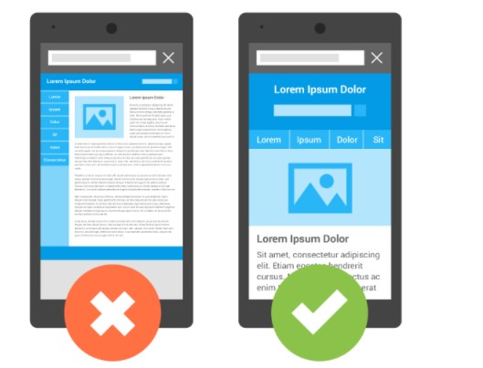
Image Source: Google
You can optimize your website design for responsiveness by:
- Scaling images for mobile users. Sometimes, even with a responsive design, the images cover the whole screen leaving no space for a call-to-action. So you need to make sure that you scale your images for mobile users.
- Having an easy to view navigation menu for mobile users. They should be able to easily navigate from page to page, using an easy-to-access site menu.
- Avoiding pop-ups that cover the whole screen, as stated on the Google 2017 update mentioned above. Pop-up images should leave space for the reader to see the content. With the advent of AdBlock, you also want to ensure that your pop-ups do not ruin a user’s experience.
- Make your calls-to-action visible. Your visitors should not have to scroll to find your call-to-action. Making it easy to find can also increase conversions.
- Shorten your text. According to a Nature Communication’s study, a hectic news cycle and social media have affected our attention spans. Exposure to more content produced in less time exhausts the collective attention faster. Too much text on your mobile site can overwhelm the user.
The mobile-first index update has helped improve the experience of mobile users. Applying these changes will help make your site more responsive.
Why do you need a responsive design? According to Google developers, it:
- Makes it easier for your website visitors to link and share your content using one URL
- Makes it easy for algorithms to assign index properties to your site
- Makes it easy to maintain multiple pages if they have the same content
- Reduces common mistakes affecting mobile sites
- Prevents users from redirection and reduces load time errors that degrade the user experience
- Saves resources when bots crawl your site. The bots only need to crawl once to retrieve all content versions of your site. This crawling efficiency helps Google index more of your content and keep it fresh.
As people continue accessing content on the go, a responsive website design gives your site a competitive edge. It also makes it easier for them to shop and increases conversions.
Thanks to improved shopping experiences on mobile, smartphones drove 54% of 2023's Black Friday online sales, adding up to $5.3 billion in spending.
It's a trend we've been seeing for a while. Shopify's Black Friday and Cyber Monday sales in 2018 happened largely on mobile.
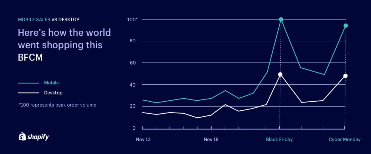
Image Source: Shopify
4. Dynamic Serving
Dynamic serving is a method that uses the same URL but serves different HTML and CSS depending on how the user arrived at the page. You will see the term "user-agent detection" a clever method to identify what type of device a visitor is using—a smartphone, tablet, or desktop computer. With this information, your website can then serve the version that looks and works best on that specific device.
You would visit a site on your desktop, and it might look different when you visit on your tablet. This isn't just a matter of layout, either. Your devices behave differently. For example, you can't hover your mouse on mobile. It's hard to use sliding menus on mobile. Mobile users can take photos and upload them faster (or at least more easily) than desktop users can. Dynamic serving is a good option when your site relies heavily on elements like that.
The challenge is that dynamic serving is more technically advanced. It isn't built into many CMS platforms the way that other technical options are, like single-URL redirects.
There's a similar outcome but with a very different tactic when you route traffic to separate URLs for mobile vs desktop.
5. Separate URLs for Mobile vs Desktop
By setting up a mobile subdomain, like m.example.com, you create a specialized space that's optimized for mobile users, ensuring they get the content and experience that's just right for their device.
The magic behind this strategy comes from redirection. When a visitor arrives, your site determines whether they're on a mobile device or a desktop. It then guides them to the version of the site where they'll have the best experience.
One caveat that affects your SEO: it's crucial to send clear signals to search engines about the main version of your site. This is done through the smart use of canonical tags. Properly indexing both versions ensures that your guests—whether they're coming from Google, Bing, or another search engine—always end up in the right place, and that your work doesn't backfire on your optimization work.
Mobile SEO Tips to Improve Your Rankings
Ready to make your website mobile-optimized? Let’s take a look at seven of the most important mobile SEO tips you can use to increase your rankings.
The mobile-first index confirmed that Google takes mobile-friendly websites seriously. Adopting the index also makes sense, considering that most searches happen on mobile.
To improve your rankings and conversion rates, you need to offer consumers a flawless experience on both mobile and desktop.
1. Provide Consistent Experiences
Today’s customer journey is nonlinear. Consumers have fragmented touchpoints because they use different channels. Many consumers will use one channel to start a transaction and finish on another. 64% of consumers have used various devices to start and complete transactions.
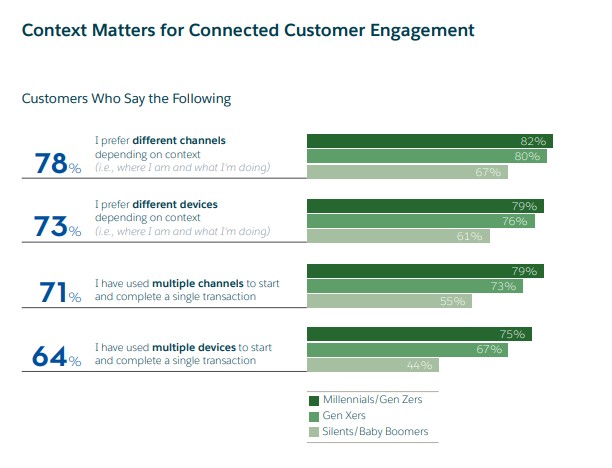
Image Source: Salesforce
Make sure that your users can access both your mobile and desktop version with ease. They should also be able to perform different actions and complete transactions seamlessly across devices.
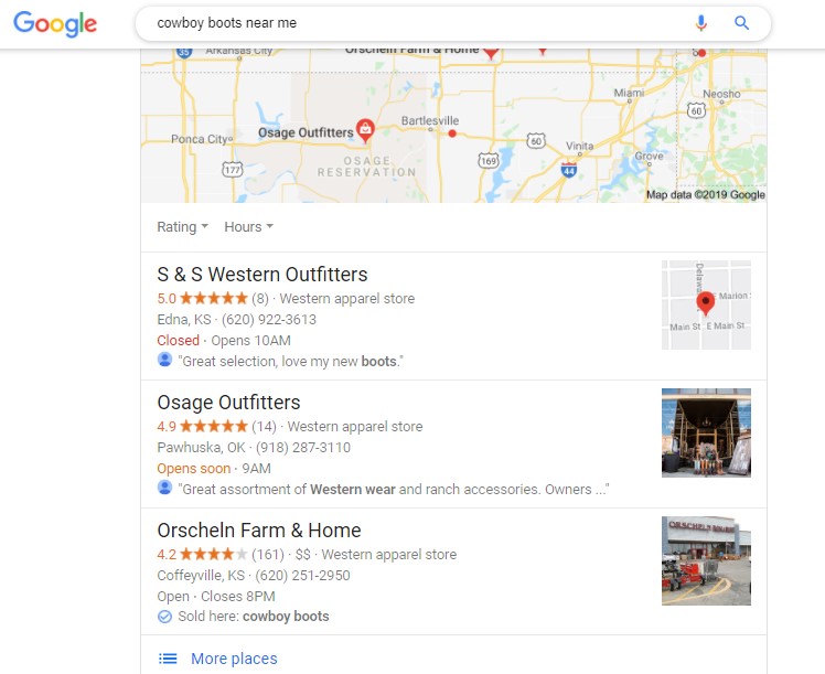
2. Optimize Content for Local Search
The search phrase “near me” is crucial for any marketer. Mobile searches containing this phrase or variants of “to buy,” or “can I buy” have grown by 500%.

Image Source: Think with Google
Near me searches have grown to include searches for specific items like shoes, boots, facial scrubs, and dresses. Your mobile site should accommodate these searches by giving consumers exactly what they want.
Optimizing your site for local SEO helps your business appear for relevant local search queries.
If you haven’t already done so, you need to head over to Google Business Profile and claim your business. Once you do so, you need to complete your listing, including the following information:
- Business name
- Business address
- Business location
- Category
- Website URL
- Phone number
Google will require that you verify the listing before they make it live. You can choose between receiving a postcard or a phone call. Once verified, you can optimize your listing further by:
- Adding categories
- Listing opening hours
- Uploading high quality photos including your logo, and a photo of your business
- Adding services you offer
- Adding additional phone numbers (if applicable)
3. Optimize for Social Media
GlobalWebIndex found that people spend an average of two hours and 23 minutes on social media platforms daily. This quarter over quarter breakdown from January 2024 shows that the trend has been steady for at least two years now.

Image Source: GlobalWebIndex via Data Reportal
You cannot, therefore, ignore social media when optimizing your mobile site.
To optimize your site for social media, make it easy for people to use the sharing button on your content. The more people share your content on social media, the more likely Google will consider you a high authority site.
Other social media best practices include:
- Use eye catching headlines on content
- Use high quality images
- Ask your readers to share
- Use hashtags,
- Include calls-to-action.
- Engage with your content. Respond to reviews and comments. Share and take part in conversations on various platforms.
- Post new and relevant content for your readers
3. Optimize Your Title Tags and Meta Descriptions
To optimize title tags and meta descriptions for mobile SERPs, follow these key guidelines:
Title Tags Optimization:
- Keep title tags concise, ideally between 50 and 60 characters. Longer titles risk being truncated in mobile search results.
- Focus on using one primary keyword in your title tag to enhance visibility and relevance.
- Avoid keyword stuffing; ensure the title is relevant to the content on the page.
- Craft unique titles for each page of your website to differentiate content and improve click-through rates.
- Place essential information at the beginning of the title to capture users' attention quickly.
Meta Descriptions Optimization:
- Aim for brief meta descriptions of fewer than 120 characters to ensure full visibility on mobile devices.
- Summarize the content of the page concisely in the meta description.
- Use natural language within the meta description to improve user interaction.
- Use distinctive meta descriptions for every page to improve user experience and SEO.
- Phrase your descriptions with CTAs that entice users to click on your link.
Most of these strategies--other than character count--are good practices for desktop, too. By embracing just a few extra steps, it helps you visibility on mobile SERPs and elevates your page's SEO qualities across the board.
Monitor your Mobile Performance
If you embrace these practices you should see a lift in your site's SEO performance compared to where it was without mobile optimization. One thing to keep you going is to see positive growth in your analytics.
Measure Mobile vs Desktop SEO Performance
Mobile vs Desktop in Search Console
You can compare your website's SEO performance on mobile versus desktop by using Google Search Console. Find the Search Results page under Performance in the navigation.
After setting your date range and page(s), click New above the chart and choose Device. Pick the tab to compare devices, and apply "desktop vs mobile."
Now you can scroll down to see clicks and impressions by queries, pages, countries, and different search variations.
Mobile vs Desktop in Google Analytics 4
If you want to find more details about sessions and engagement, you can open a report like Traffic Acquisition and set the device category. Follow these steps (which can be used similarly with other GA4 reports like Landing Page):
- Sign into Google Analytics, navigate to Reports>Traffic Acquisition
- Scroll down to Session primary channel group. Click the arrow to the right.
- Search "device category" or find it via Platform/device>Device Category
These steps will add desktop and mobile to your channel details.
Conclusion
These mobile SEO tips can help you make your website mobile friendly. Don’t forget to monitor the performance of your site to ensure that you are always on the right track.
Also always work on improving the user experience on your website. Visitors should be able to easily navigate your site and find relevant, quality content that meets their needs.
